

Creating an interactive application with Polymer (Part 1)
#Polymer
#Web Frontends
#WebComponents

Some time ago I created my first post about web components and today I want to continue this series. In the last month I played a lot with this new technology since at Canoo we think that this will be very important for web development in the future. Therefore Michael Heinrichs and I will give a university session at Devoxx this year and plan to offer web component and Polymer training at Canoo.
In this blog post I will create an interactive web application based on Google Polymer 1.0 to show how data binding can be used and how a basic Polymer application might look like. In this case I don't want to dive deep into the creation of custom components using Polymer but give a first introduction how you can design applications by using the Polymer paper elements.
What is Polymer?
Google Polymer is an open source toolkit that is build based on the web component specification and provides some additional features. In addition Polymer provides it's own UI component suite that is based on the Material Design style by Google.
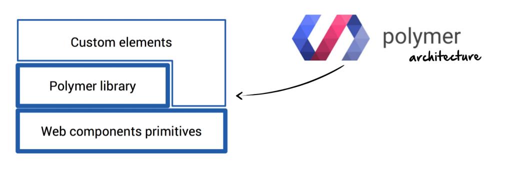
Based on Polymer and web components it's very easy to create a web application that is based on custom components instead falling in the <div> hell.
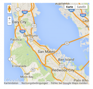
Here is a short example that shows how a Google maps web component can be integrated in any web page:
<script src="components/webcomponentsjs/webcomponents-lite.min.js"></script>

<!-- Import element -->
<link rel="import" href="components/google-map/google-map.html">

<!-- Use element -->
<google-map latitude="37.790" longitude="-122.390"></google-map>
Polymer provides an element catalog with documentation and many examples of all components that are part of the lib.
Project setup
Let's start with a first project that uses Polymer and the Polymer paper components to create an application. This project only needs 2 file:
- a
index.htmlthat contains our application - a
bower.jsonthat defines all external dependencies
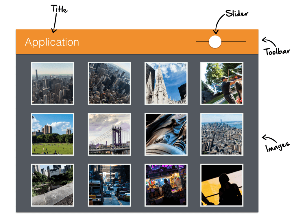
Our final application should be a picture viewer that support some user interaction. I want to change the size of all images by using a slider. Here is a first sketch:
To use the Polymer paper components we only need 1 dependency to PolymerElements/paper-elements in the bower file. If you are not familiar with Bower you can find a short introduction here.
Once you have added the dependency your bower.json file like look like this:
  "name": "polymer-interaction",
  "version": "1.0.0",
  "authors": [
    "Hendrik Ebbers <hendrik.ebbers@web.de>"
  ],
  "license": "MIT",
  "ignore": [
    "**/.*",
    "node_modules",
    "bower_components",
    "test",
    "tests"
  ],
  "dependencies": {
    "paper-elements": "PolymerElements/paper-elements#1.0.5"
  }
}
After calling bower install all dependencies are downloaded to the bower_components folder. This includes:
webcomponentsjs- A polyfill that provides the features of the web components spec for browser version that doesn't support native support for the featurespolymer- the basic api of polymer.paper-*- all Polymer paper components like controls and layoutsiron-*- basic web components like an icon view. The Polymer paper components are based on this basic components
Once this is done we can create the initial index.html file. Here we will start to provide the functionality of the web components spec by adding the polypill. To do so we include the script in our page:
<head>
    <meta charset="utf-8">
    <meta name="description" content="">

    <script src="bower_components/webcomponentsjs/webcomponents.js"></script>
</head>
<body>
</body>
</html>
Now we can start using the new features. We want to start with the import. In our example we need the Polymer API and some paper components. Therefore we add imports to all these dependencies:
<head>
    <meta charset="utf-8">
    <meta name="description" content="">

    <script src="bower_components/webcomponentsjs/webcomponents.js"></script>

    <link rel="import" href="bower_components/paper-header-panel/paper-header-panel.html">
    <link rel="import" href="bower_components/paper-toolbar/paper-toolbar.html">
    <link rel="import" href="bower_components/paper-slider/paper-slider.html">

</head>
<body>
</body>
</html>
The paper elements already depends on the Polymer API and therefore we don't need to add it explicitly.
Starting with Polymer
Since Polymer is a framework for web components we will create a component that wraps our complete application view. To do so we need a html template and some JavaScript for the Polymer boostrap / configuration. A first simple example of such a component looks like this:
    <template>
        CONTENT
    </template>
</dom-module>

<script>
    Polymer({
        is: "app-view"
    });
</script>
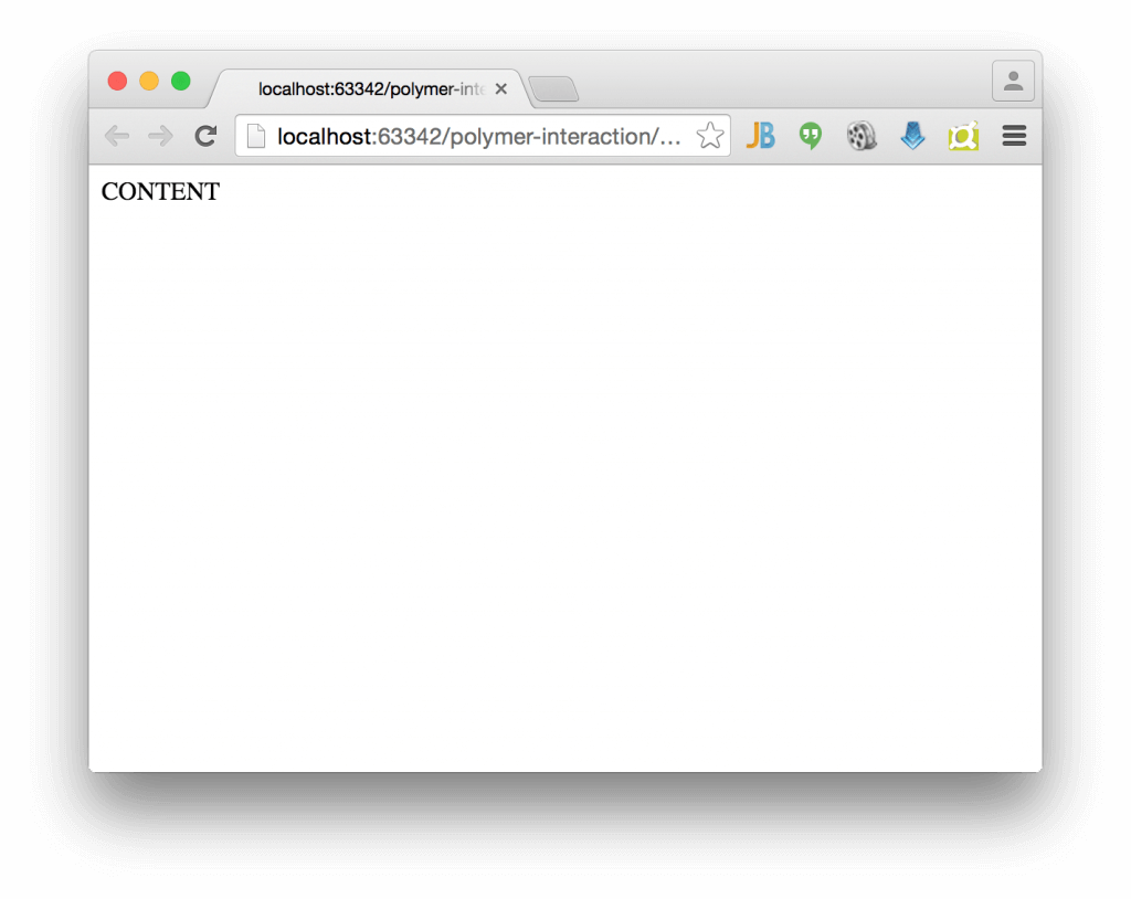
This code snippet defines a Polymer based web component that can be added to a html page by using the <app-view> tag (as defined in the polymer id). This web component only contains the static text "Content". Let's add this code snippet and the custom tag to our index.html:
<head>
    <meta charset="utf-8">
    <meta name="description" content="">

    <script src="bower_components/webcomponentsjs/webcomponents.js"></script>

    <link rel="import" href="bower_components/paper-header-panel/paper-header-panel.html">
    <link rel="import" href="bower_components/paper-toolbar/paper-toolbar.html">
    <link rel="import" href="bower_components/paper-slider/paper-slider.html">

</head>
<body>
<app-view></app-view>
</body>

<dom-module id="app-view">
    <template>
        CONTENT
    </template>
</dom-module>

<script>
    Polymer({
        is: "app-view"
    });
</script>

</html>
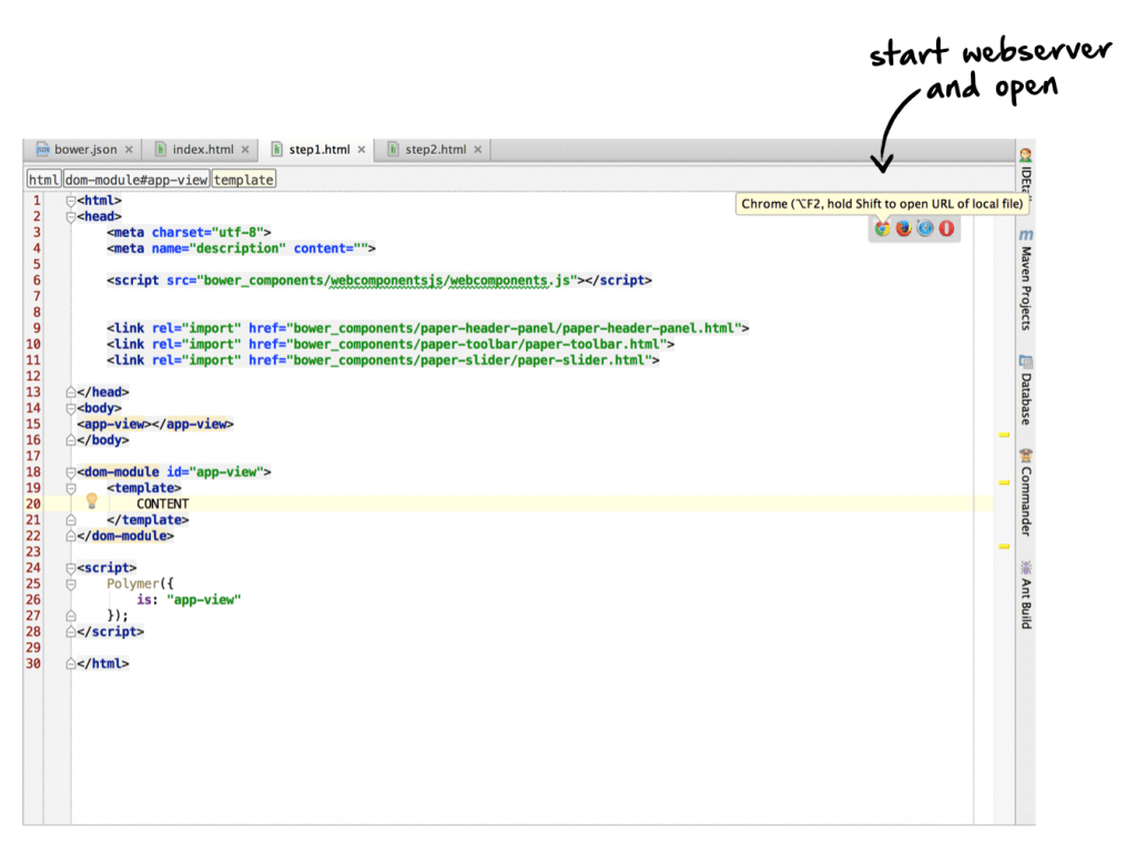
Here is a pic of the current state in chrome:
As a Java developer I simply use IntelliJ to test my app. By opening the page from IntelliJ the IDE starts automatically a web server to provide the web app.
If you don't use IntelliJ there are several other ways how you can test your app.
Let's add some first Polymer paper elements. Here I want to start with a paper-header-panel that defines a header and a content area. The header area is always on top and you can use it perfectly to display a toolbar. The content are will fill the rest of the page size and is scrollable by default.
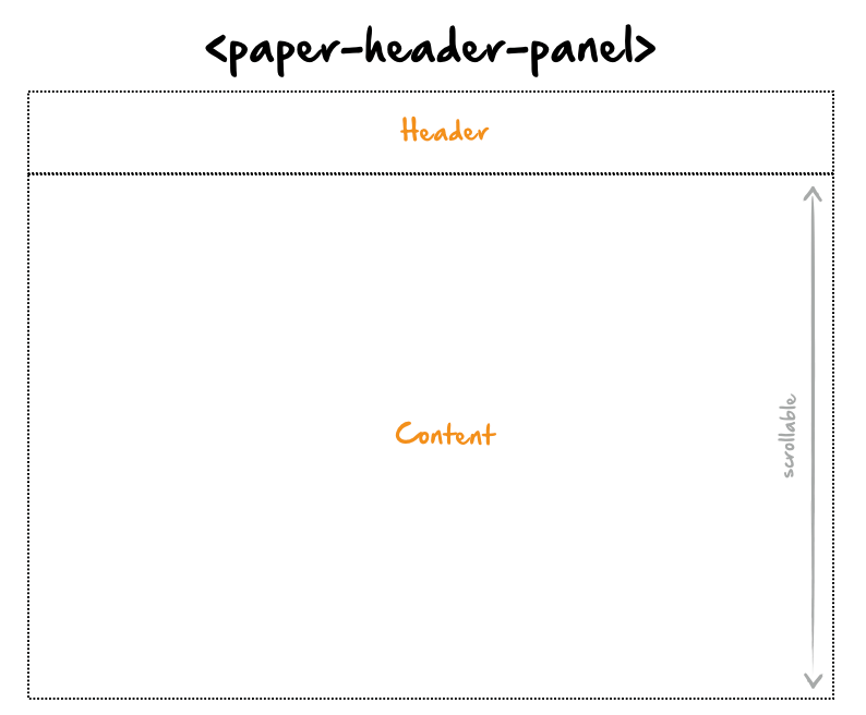
In this header panel we want to add a toolbar with a title and a slider. For all these components Polymer paper offers ready to use web components. How this components can be used is documented in the Polymer elements catalog. Once this is done our code look like this:
<head>
    <meta charset="utf-8">
    <meta name="description" content="">

    <script src="bower_components/webcomponentsjs/webcomponents.js"></script>


    <link rel="import" href="bower_components/paper-header-panel/paper-header-panel.html">
    <link rel="import" href="bower_components/paper-toolbar/paper-toolbar.html">
    <link rel="import" href="bower_components/paper-slider/paper-slider.html">

</head>
<body>
<app-view></app-view>
</body>

<dom-module id="app-view">
    <template>
        <paper-header-panel class="main-wrapper">
            <paper-toolbar >
                <span class="title">Polymer interaction</span>
                <paper-slider></paper-slider>
            </paper-toolbar>
            <div>CONTENT</div>
        </paper-header-panel>
    </template>
</dom-module>

<script>
    Polymer({
        is: "app-view"
    });
</script>

</html>
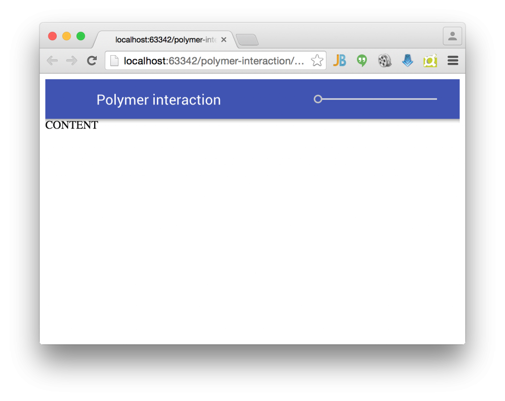
In chrome we can already see the toolbar but the layout doesn't look that perfect:
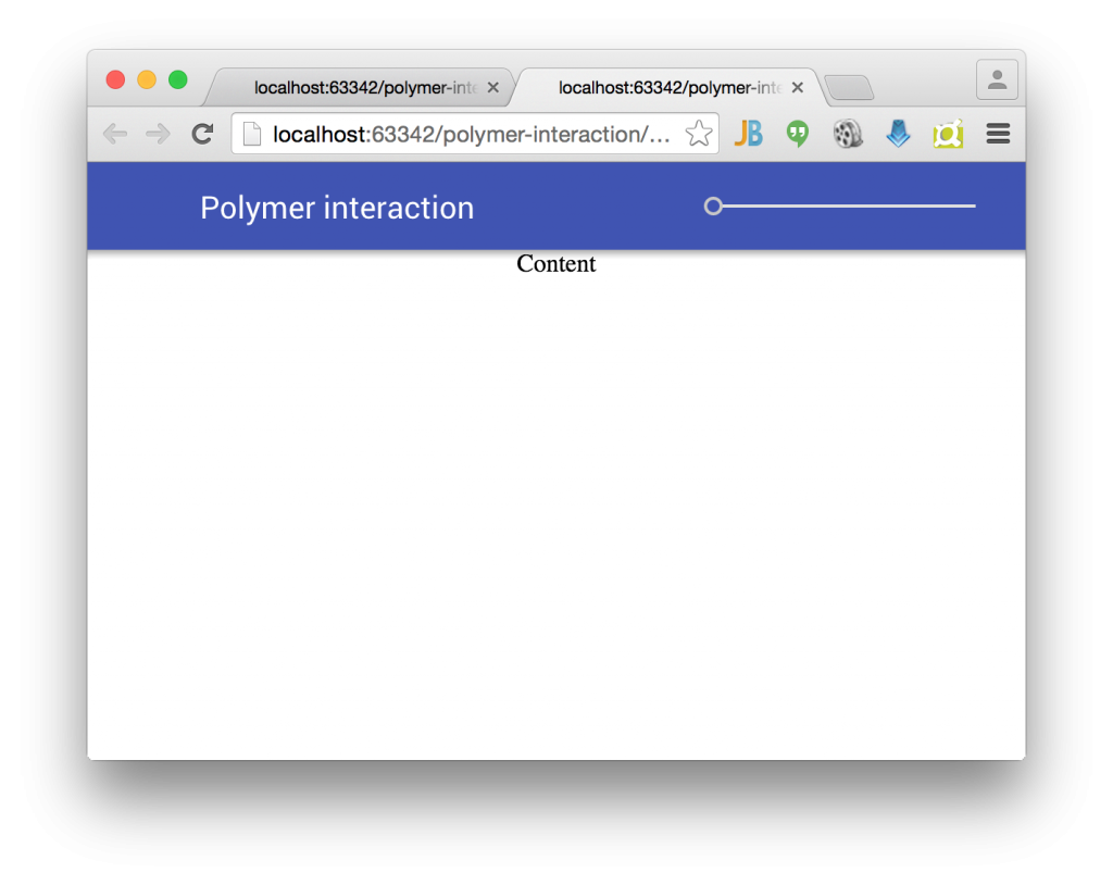
Polymer provides a flexbox based layout that can be simply modified by using custom attributes that are provided by Polymer. I don't want to dive deep here in flexbox and Polymer layout (since this post is already very long) and simply show the final code:
<head>
    <meta charset="utf-8">
    <meta name="description" content="">

    <script src="bower_components/webcomponentsjs/webcomponents.js"></script>


    <link rel="import" href="bower_components/paper-header-panel/paper-header-panel.html">
    <link rel="import" href="bower_components/paper-toolbar/paper-toolbar.html">
    <link rel="import" href="bower_components/paper-slider/paper-slider.html">

</head>
<body unresolved class="fullbleed">
<app-view></app-view>
</body>

<dom-module id="app-view">
    <template>
        <paper-header-panel class="main-wrapper">

            <paper-toolbar >
                <span class="title">Polymer interaction</span>
                <paper-slider></paper-slider>
            </paper-toolbar>
            <div class="horizontal layout center-justified wrap">
               Content
            </div>
        </paper-header-panel>
    </template>
</dom-module>

<script>
    Polymer({
        is: "app-view"
    });
</script>

</html>
Ok, as a next step I want to add some static images. Therefore I will use lorempixel.com that is a perfect service to get some random images. After adding some images to the content as shown in the following code snippet our application already look like some kind of image viewer:
  <img src="http://lorempixel.com/320/320/animals/1/">
  <img src="http://lorempixel.com/320/320/animals/2/">
  <img src="http://lorempixel.com/320/320/animals/3/">
  ...
</div>
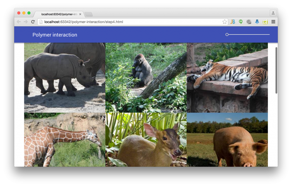
Thanks to the flex box layout that is used in Polymer the images are aligned in a responsive grid. When resizing the browser windows the column count in each row will fit to the width of the browser. In addition a scrollbar automatically appears if all images can't be shown on screen.
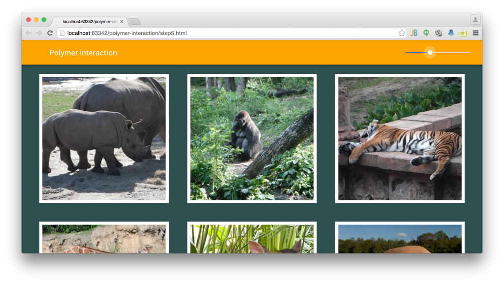
As a next step I want to finalize the styling of our application by adding some CSS. Here is the final html file:
<head>
    <meta charset="utf-8">
    <meta name="description" content="">

    <script src="bower_components/webcomponentsjs/webcomponents.js"></script>

    <link rel="import" href="bower_components/paper-header-panel/paper-header-panel.html">
    <link rel="import" href="bower_components/paper-toolbar/paper-toolbar.html">
    <link rel="import" href="bower_components/paper-slider/paper-slider.html">

</head>
<body>
<body unresolved class="fullbleed">
<app-view></app-view>
</body>
</body>

<dom-module id="app-view">
    <style>
        #toolbar {
            background: orange;
        }
        #slider {
            --paper-slider-pin-color: white;
            --paper-slider-knob-color: white;
        }
        .image {
            margin: 24px;
            border-color: white;
            border-width: 8px;
            border-style: solid;
        }
        .content-wrapper {
            background: darkslategray;
        }
    </style>
    <template>
        <paper-header-panel class="main-wrapper">

            <paper-toolbar id="toolbar">
                <span class="title">Polymer interaction</span>
                <paper-slider id="slider"></paper-slider>
            </paper-toolbar>
            <div class="horizontal layout center-justified wrap content-wrapper">
                <img class="image" src="http://lorempixel.com/320/320/animals/1/">
                <img class="image" src="http://lorempixel.com/320/320/animals/2/">
                <img class="image" src="http://lorempixel.com/320/320/animals/3/">
                <img class="image" src="http://lorempixel.com/320/320/animals/4/">
                <img class="image" src="http://lorempixel.com/320/320/animals/5/">
                <img class="image" src="http://lorempixel.com/320/320/animals/6/">
                <img class="image" src="http://lorempixel.com/320/320/animals/7/">
                <img class="image" src="http://lorempixel.com/320/320/animals/8/">
                <img class="image" src="http://lorempixel.com/320/320/animals/9/">
                <img class="image" src="http://lorempixel.com/320/320/animals/10/">
            </div>
        </paper-header-panel>
    </template>
</dom-module>

<script>
    Polymer({
        is: "app-view"
    });
</script>

</html>
Ok, this will be enough for today :)
In the next post I will show how the Polymer properties and data binding can be used to create the needed interaction.

