

An overview of the Web Component specifications
#General
#WebComponents

WebComponents are a new W3C standard that is defined by some new specification:
- Element Template
- Shadow DOM
- Custom Elements
- HTML Imports
An overview about this specs and how they can be used in HTML can be found in the presentation that I did with Michael Heinrichs at JFokus in detail. Therefore I only want a short overview here.
Element Template
By using the template tag you can define a reusable template of a HTML hierarchy that can be reused and added to your DOM. Let's say you define the following template:
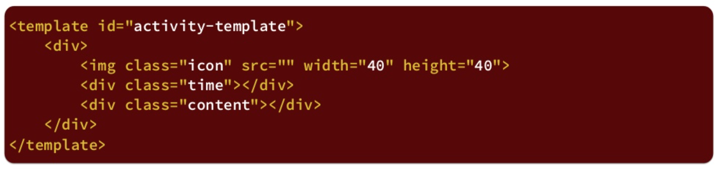
Once you have defined this template you can create a instance in JavaScript and add it to the DOM of the page:
By doing so you can reuse the defined template several times in your page.
Shadow DOM
Let's say you have defined a template (or a web component as we will see later) and use it in your application. By doing so the DOM of your component will be added to the page DOM. If you than want to style your page by using CSS or access the page by JavaScript there are some pitfalls. As an example the following DOM is created and a component (green) is added to the regular DOM (blue). A node in the page and in the component uses the same ID or style class:
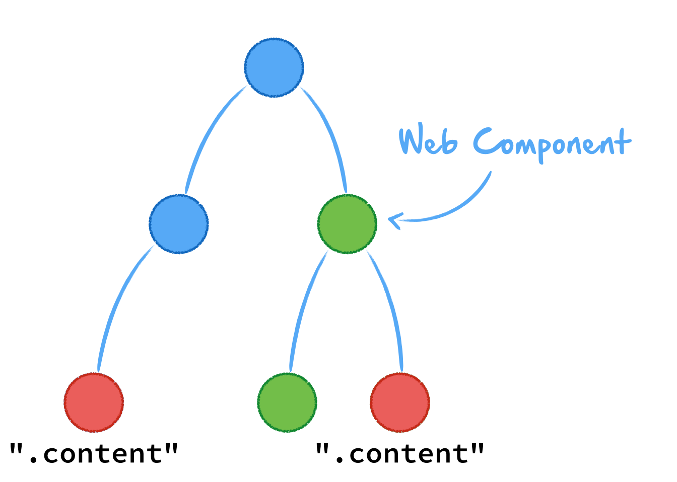
Maybe the component was created by a different developer or it is part of a 3rd party module. In this case you maybe don't know about the internal IDs or style classes. When styling or modifying your application you would use the following code:
document.querySelector(".content")

//CSS
.content {
    color: blue;
}
In both cases your code will affect the node in the regular DOM and in the component. But normally you don't want to change the component. Therefore the Shadow DOM was introduced. By using the shadow DOM the nodes of the component are separated from the regular DOM:
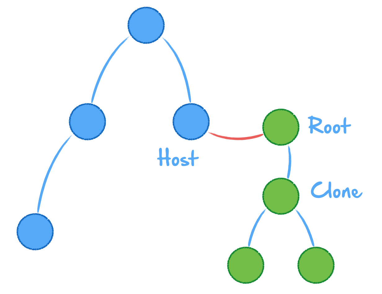
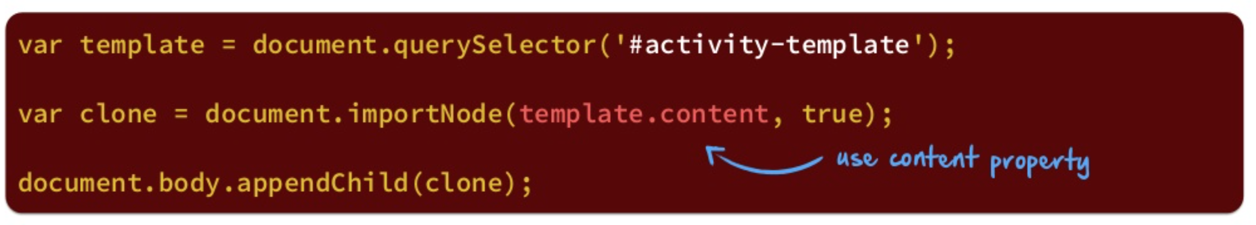
Once this is done CSS or JavaScript changes won't affect the component that is capsulated by the Shadow DOM. A component in a Shadow DOM can be created by using JavaScript:
var clone = document.importNode(template.content, true);
root.appendChild(clone);
Custom Elements
The Custom Elements spec makes use of templates and the shadow DOM. By doing so you can specify a component and add it to a page in a Shadow DOM. In addition the spec defines a lifecylce for components.
By using the Custom Elements spec you can define reusable tags for your components. Let's say you want to define a activity stream like in Facebook or Twitter. To do so we want to create a custom element for the entries in this stream.
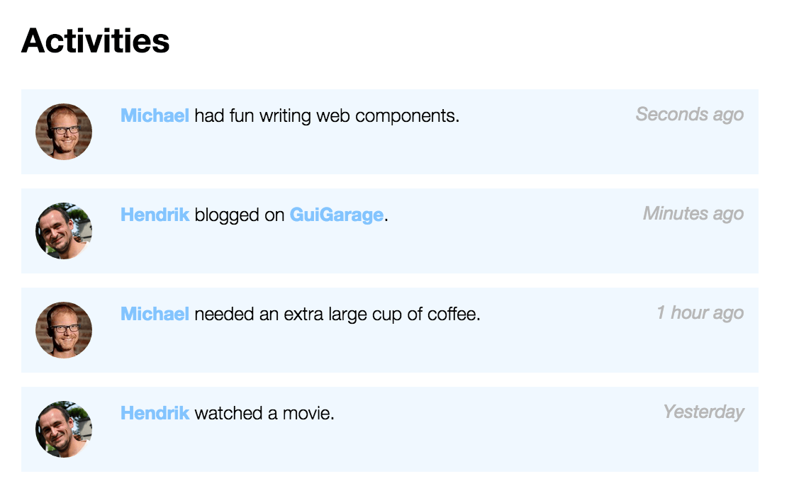
Normally you need to define a div hierarchy for any entry in the stream. This ends in a lot of boilerplate code like shown in the following snippet:
    <img class="icon" src="../img/michael.png" width="40" height="40">
    <div class="time">Seconds ago</div>
    <div class="content">
        <a href="profiles/michael">Michael</a> had fun writing web components.
    </div>
</div>
<div class="activity">
    <img class="icon" src="../img/hendrik.png" width="40" height="40">
    <div class="time">Minutes ago</div>
    <div class="content">
        <a href="profiles/hendrick">Hendrik</a> blogged on <a href="http://guigarage.com">GuiGarage</a>.
    </div>
</div>
This don't look readable and what we really want to do is something like this:
    <a href="profiles/michael">Michael</a> had fun writing web components.
</activity-card>
<activity-card iconSrc="../img/hendrik.png" time="Minutes ago">
    <a href="profiles/hendrick">Hendrik</a> blogged on <a href="http://guigarage.com">GuiGarage</a>.
</activity-card>
This can be done by using Custom Elements. To do so we first create a template:
  <div>
    <img class="icon" src="" width="40" height="40">
    <div class="time"></div>
    <div class="content"><content></content></div>
  </div>
</template>
Once this is done we need to write some JavaScript code to create a custom element that is based on this template:
    var activityPrototype = Object.create(HTMLElement.prototype);

    activityPrototype.createdCallback = function() {
        var template = importDoc.querySelector('template');
        var clone = document.importNode(template.content, true);

        var host = $(this);
        $(".icon", clone).attr("src", host.attr("iconSrc"));
        $(".time", clone).text(host.attr("time"));

        var shadowRoot = this.createShadowRoot();
        shadowRoot.appendChild(clone);
    };

    // Register our new element
    document.registerElement('activity-card', {
        prototype: activityPrototype
    });
Once this is done the activity-card tag can be used in our application. In the JavaScript code a method called createdCallback is defined. This method is part of the Custom Elements lifecycle and will be called once the component is created. Next to this method the following methods are defined in the lifecycle:
createdCallbackattachedCallbackdetachedCallbackattributeChangedCallback(attrName, oldVal, newVal)
HTML Imports
When using the first 3 specs we can define reusable components in our HTML page. But all the code is still part of our HTML (or JavaScript) file. This is ok if we only want to create a single HTML page. But when creating a big application you will have several HTML files and you don't want to define the reusable components on any page. Therefore the import can be used. By doing so you can specify a reusable component in a extracted HTML file that can be reused on any page. By doing so it's even easy to create components that can be shared between several projects.
Using the import is easy. You only need to specify an import link that points to the file that contains the component specification:
Once this is done you can simply use the custom component in the page.
Concusion
This is only a quick overview to the new specifications without going to much into details. If you want to learn more you should have a look at our slides or additional documentation on the web.
[slideshare id=44255563&doc=jfocus-webcomponents-final-150204052708-conversion-gate01]
A god starting point is the webcomponents.org page that contains a lot of documentation.
When trying to create your first own web component you will maybe see a big problem: Today most of the modern browsers don't support this new specs.
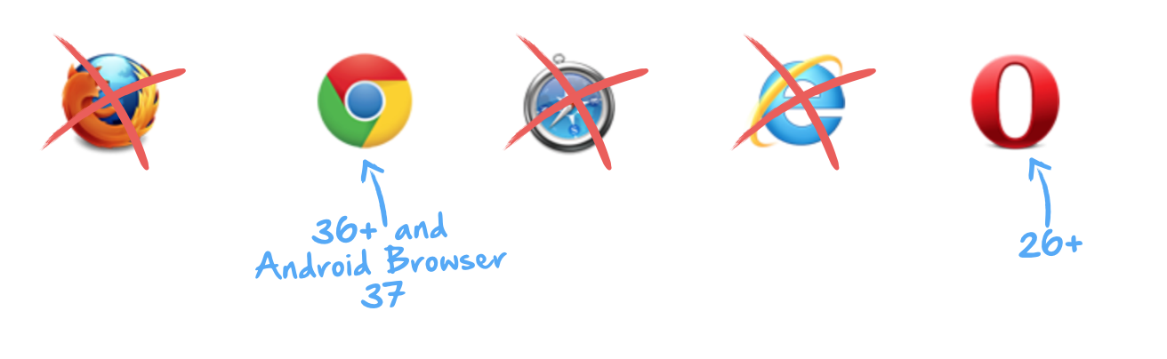
As a workaround you can use the webcomponents.js polypill that will add the support of the shown specs to mostly all evergreen browsers. I plan to give an introduction to this polypill in a separate post.