

Responsive Design for JavaFX
#JavaFX

Once of the new APIs that I have shown at JavaOne was ResponsiveFX that can be used to add responsive design to your JavaFX application. ResponsiveFX is an open source project maintained by Canoo and will be published to Maven Central the next days.
Responsive Design
Today software must fit a wide range of devices. When developing an application customers often want to use it on a desktop pc and on a tablet. In addition a subset of the features should be useable with a mobile phone. Oh, and maybe next year the first customers want to check information on a smart watch. Even if web apps and JavaFX applications can be distributed and used on most of this devices you can't simply use the same UI on them.
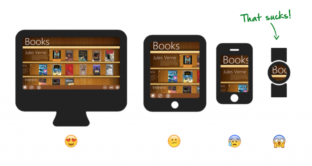
All these devices provide different screen sizes and resolutions. In addition the user interaction is in some parts completely different. While using a mouse and keyboard on a desktop pc you want to use touch and gestures on your mobile to navigate through the app.
One approach to handle these issues is responsive design that can be used to provide an optimal viewing experience—easy reading and navigation with a minimum of resizing, panning, and scrolling—across a wide range of devices. Responsive design was first introduced by web applications and influenced the development trends in this area. By defining different layout for specific screen sizes the fronted of a web application will look good on mostly all devices.

ResponsiveFX
The core concept of ReponsiveFX is copied from Twitter Boostrap that provides responsive design for HTML. Boostrap provides several CSS style classes that can be used to hide or show components on different screen sizes. Here is a short overview of all the style classes:
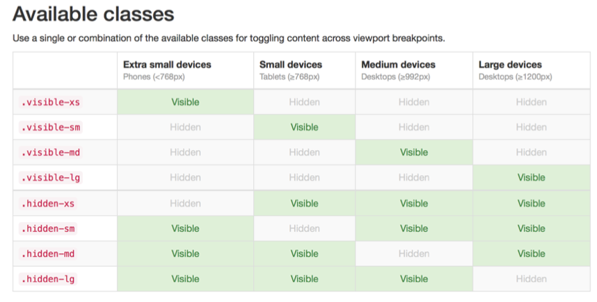
By adding one of these style classes to a component the visibility of the component depends on the current frame size. Here is a small example how this can be used in HTML:
<div class="visible-xs">small text<div>
Responsive Design & JavaFX
By default JavaFX doesn't provide an API for responsive design. Thankfully JavaFX supports CSS and therefore we can add this feature. This is exactly what ReponsiveFX does. By using the API you can simply use the same style classes as in HTML in your JavaFX application. To add the responsive support to an application you only need one line of Java code:
This adds the support for responsive design to the given stage. All nodes that are in this stage can now use the described style classes. Therefore you can simply do the following in Java code:
table.getStyleClass().addAll("visible-lg", "visible-md");

ListView list = new ListView(items);
list.getStyleClass().addAll("visible-xs", "visible-sm");

pane.getChildren().addAll(table, list);
In the example a table and a list are defined that will visualize the same set of data (items). Depending on the size of the application the list or the table will be shown on screen. Here is a short video that shows the behavior:
By adding this API to your JavaFX application you will have the same possibilities as in HTML to provide responsive design.
Responsive Design & pseudo classes
By using the given classes you can hide and show components depending to the frame size in your application but often you want to show different sizes of controls depending on the screen size. Let's think about a toolbar that should have a different size in all supported screen sizes. In HTML you would do the following:
<div class="visible-sm">...<div> <!--small-->
<div class="visible-md">...<div> <!--medium-->
<div class="visible-lg">...<div> <!--large-->
In JavaFX this would correspond the following code snippet:
extraSmallToolbar.getStyleClass().add("visible-xs");

Toolbar smallToolbar = new Toolbar(...);
smallToolbar.getStyleClass().add("visible-sm");

Toolbar mediumToolbar = new Toolbar(...);
mediumToolbar.getStyleClass().add("visible-md");

Toolbar largeToolbar = new Toolbar(...);
largeToolbar.getStyleClass().add("visible-lg");

pane.getChildren().add(extraSmallToolbar, smallToolbar, mediumToolbar, largeToolbar);
This is very bad practive because Java must handle all 4 instances in this case. Even if only one toolbar will be displayed on screen all are part of the scene graph. If you will do this with controls that contains images you will blow up your memory for example. Therefore you shouldn't do this. I thinks it's clear that we need a better solution and ResponsiveFX contains one :)
Next to the style classes ReponsiveFX provides pseudo classes for all supported screen sizes. Here is a list of the supported pseudo classes:
- extreme-small-device
- small-device
- medium-device
- large-device
By using this pseudo classes you can define the visualization of a node depending on the current application size. The pseudo classes will automatically be added and removed for each node inside the scene graph of a windows that is handled by the ResponsiveHandler. Thanks to this you can define the following CSS rules for a control:
    -fx-background-color: deepskyblue;
}

#toolbar:extreme-small-device {
    -fx-padding: 1 1 0 1;
}

#toolbar:small-device {
    -fx-padding: 2 2 1 2;
}

#toolbar:medium-device {
    -fx-padding: 6 6 1 6;
}

#toolbar:large-device {
    -fx-padding: 6 6 1 6;
    -fx-background-image: url(blue-background.png);
}
In your Java code you can now define one control and set its ID to match the CSS rules:
myToolbar.setId(toolbar);
pane.getChildren().add(myToolbar);
Whenever the size of the application will change the matching pseudo class will be set to the control and the visualization of the control will change depending on the CSS attributes. By doing so you can create applications that will look different on the specified frame sizes. This will be helpful when developing applications that should work for desktop and mobile or on embedded devices. Here is a short video that shows how a responsive application might look:
Responsive Design in Java code
In addition to the shown features ReponsiveFX supports a Java API to react on responsive changes. A listener can be registered to the ResponsiveHandler and will be fired whenever the responsive types changes. By doing so you can react on changes direct in Java code. This will be helpful if you need to change anything that can't be done by CSS. AT the moment this feature is a fast hack for JavaOne but I plan to refactor this in near future.
Where can I get it?
As said ResponsiveFX will be released in near future. I'm currently create clean modules / libraries of all the demos and examples that I showed at JavaOne. ResponsiveFX is already extracted as a stand alone library. The next days I will set up the GitHub repo and add some documentation. Once this is done I will upload the first version to Maven Central.
Additional Information
Because of a missing feature in JavaFX ReponsiveFX contains some hacks that can result in unwanted behavior. If you like the API and need responsive design in JavaFX you should vote for this issue at the JavaFX bug database.