Enrich your List UI by using the MediaListCell
#JavaFX
By default the cells of a ListView will show only a string representation of your data on screen. This is ok for a basic implementation and will work for a lot of use cases. But if you have a application that contains a big list like a news feed or a chat you need a better skin for the cells. For JavaOne I created some JavaFX APIs that contains basic utilities and controls that can be easily integrated in any JavaFX application. The ui-basics module contains some custom list cells that can be used to enrich your JavaFX application. By using this cells we can achieve the following UI change with only a few lines of Java code:
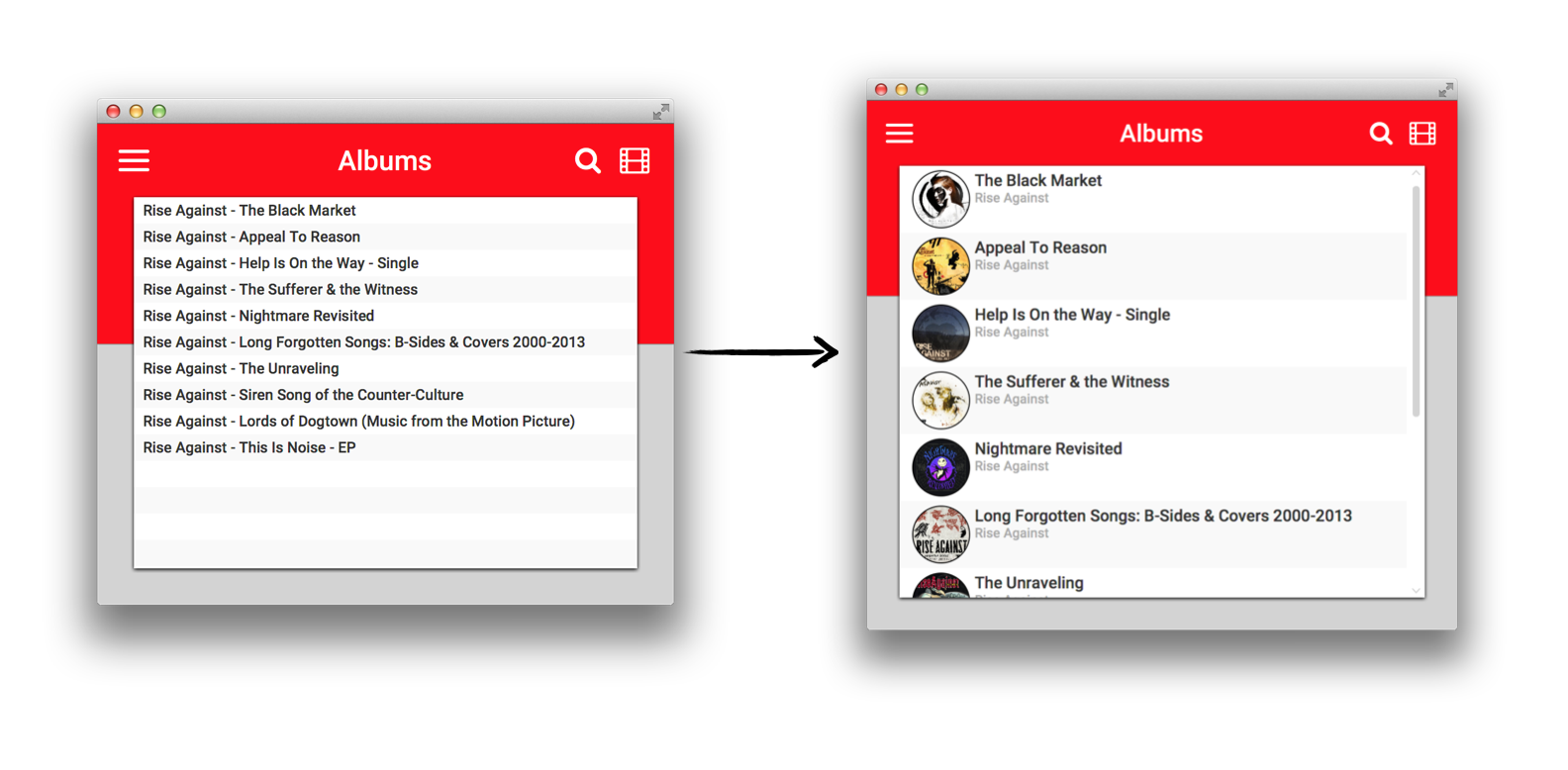
The following graphics shows the inheritance of the new cell classes:
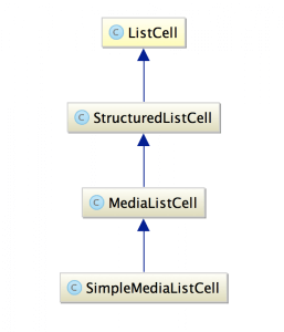
The StructuredListCell defines a cell that splits a cell in 3 regions: left, center and right. The center region will grow by default:
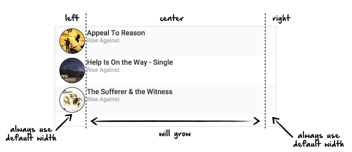
You can add any content to the cell by calling the following methods:
setRightContent(Node node)
setRightContent(Node node)
In addition the cell provides some new CSS attributes to style it:
-fx-left-alignment: Defines the vertical alignment of the left content-fx-center-alignment: Defines the vertical alignment of the center content-fx-right-alignment: Defines the vertical alignment of the right content-fx-spacing: Defines the spacing between the 3 regions-fx-height-rule: Defines which region should be used for the height calculation. By default the center content is used. This means that the cell will be as high as the center content.
The MediaListCell extends this cell definition. It sets the center content to a a title and a description label. If you want to use the cell you only need to call setTitle(...) and setDescription(...) to define the center content:
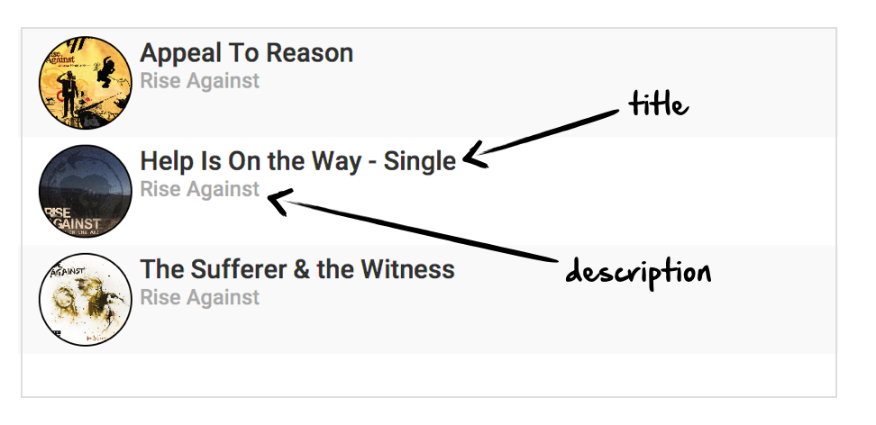
The class provides default style classes for both labels:
media-cell-titlemedia-cell-description
In addition the class provides two new CSS properties:
-fx-show-description: Defines if the description label should be visible-fx-text-spacing: Defines the spacing between the title and description label
If you want the UI as shown in the demo you should use the SimpleMediaListCell class. This adds a rounded image view as the left content. By using this cell its very easy to create a list view like you know from many modern applications. To make the use of the cell even easier I introduced the Media interface. The SimpleMediaListCell is defined as SimpleMediaListCell<t extends media /> and therefore it can only used with data that implements the Media interface. This interface is quite simple as you can see in its source:
    StringProperty titleProperty();

    StringProperty descriptionProperty();

    ObjectProperty<Image> imageProperty();
}
The properties of the nodes in the cell are automatically bound to the properties that are provided by the interface and therefore the SimpleMediaListCell class can be used like shown in the following example:
    private String artist;

    private String coverUrl;

    private String name;

    //getter & setter

    @Override
    public StringProperty titleProperty() {
        return new SimpleStringProperty(getName());
    }

    @Override
    public StringProperty descriptionProperty() {
        return new SimpleStringProperty(getArtist());
    }

    @Override
    public ObjectProperty<Image> imageProperty() {
        return new SimpleObjectProperty<>(new Image(getCoverUrl(), true));
    }
}

//In View class...

ListView<Album>listView = new ListView<>();
listView.setCellFactory(v -> new SimpleMediaListCell<>());
listView.setItems(dataModel.getAlbums());
All the cell classes are part of the ui-basics module that can be found at github:
  <groupId>com.guigarage</groupId>
  <artifactId>ui-basics</artifactId>
  <version>X.Y</version>
</dependency>
further development
At the moment I plan some new features for the cells. As you might have registered the right region wasn't used in this example. In most UIs this is used to define a user action or hint like shown in this image:

I plan to add this as a default feature. In addition I will provide different styles for the image view. Maybe you don't want a rounded view. In this case it would be perfect to define a style by css. Please ping me if you have some other cool improvements :)