

How to choose the right color
#General
#Layout & UI

When creating a new control or a complete application I often ask myself what colors I should use for visualization. When defining a control the best solution is to provide properties for all colors.
By doing so a developer that uses the component can configure it to match the needed color scheme. But still when developing only a control you should provide a color scheme as a default configuration. Here it's important the the colors of the default configuration fit to each other. If you develop a complete application the selection of a specific color scheme is even more important. Sometimes you will get some defaults by your customer but in other projects it might be your part to define a nice selection of colors. If I need to do this I'm always happy about some help and inspiration. Today it's quite easy to get this help for free since there are some good online resources that can be used to pick some colors or a complete scheme for your application or control. Today I want to introduce 2 of them.
Material Design Color Palette
For the Material Design style Google create a style guide with a lot of information how components, layouts, colors, and animation should look and behave. One part of this specification defines how colors should be used in the Material Design style and what colors should be used together. You can find the description here. In this documentation Google provides a color palette that should be used in Material Design. This color palette defines several basic colors ands adds several accents colors to each basic color. Here is an example:
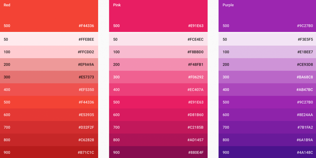
If you now need to define a component or an application you can simply choose one of the base colors and create subparts or effects by using the accents colors. Lets say you create a special error button. As the base color of the button you choose the red color as it's defined as a base color in the palette. But then you need several addition color definitions that defines a pressed state of the button or a glow if the button is focused, for example. Here you can easily use the accents colors for red. If you are a JavaFX developer you can simply use a little tool by Gerrit Grundwald to pick the needed colors.
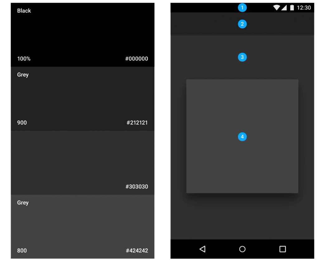
Next to the color palette the Material design specification defines general light and dark theme. The colors that are shown here are quite helpful to create basic parts of a control or application like panes and menus. The following picture shows an example of the dark theme:
Colors
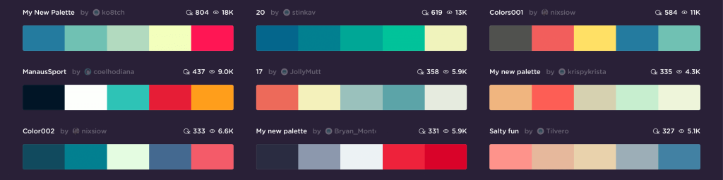
Another very helpful tool to create a complete color scheme is the Coolors web application. This application let you simple create new color schemes or choose an scheme that was created by the community.
When creating your own scheme you start the generator that shows a random scheme with 5 colors. By pressing space a new scheme will be generated and appears on the screen.
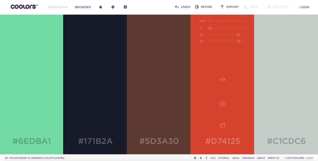
Whenever a scheme contains one or more colors that look good you can lock them. By doing so they won't change anymore and with the next scheme generation only the colors that are not locked will change. Since all the colors in a scheme always fit to each other it's quite easy to create a custom color scheme by using this tool.