

AquaFX: lessons learned (Part I)
#AquaFX
#JavaFX

During the work on AquaFX there were some obstacles that needed to be overcome. With some research, the CSS Reference Guide and the help of google, most answers definitely can be found, so please don't be angry with me when those tips might be obvious for you. In this article I want to summarize information, so that they might help people who just face the same questions, as I had. And don't hesitate to contact me/ comment when you know a better way for some things or think they might be wrong :-)
So, let's get started:
class selection & CSS
Using CSS is pretty familiar to most developers. For me, it is a long time ago, that I styled HTML pages with CSS, so I had to learn some things over. Fortunately, JavaFX uses CSS in a simple yet powerful way.
class selection
If you style controls, you have to explicitly select a desired section, to achieve your goal. This is the case, e.g. when you style a ComboBox or a CheckBox. The mark of a CheckBox can be selected by using .check-box > .box > .mark { ... }
which navigates the selection through the substructure of this control to the class .mark. The concrete structures can be seen in CSS Reference Guide and by using ScenicView.
So what does the ">" mean?
It means, the class named after it, is a direct child of the class before. If there is a class .xy in the structure between those classes, the style won't be applied. Siblings do not affect this definition.
In contrast, a definition like .classA .subclassB { ... } can be used. The difference is, that it does not matter how many classes are between those two. This causes JavaFX to invest more computing time for parsing the scenegraph, because the whole tree has to be checked for this possible constellation.
Though I use this in my AquaToolBar e.g.
This gives me the possibility to explicitly style Buttons in ToolBar in a different style than usual, although maybe wrapped in 1..n Panes, like HBoxes/ VBoxes.
Another selector is .classX.classY which means nothing else, than they apply to the same thing. Since it is possible to add multiple style classes to a component, you can use this selection, to find a specific class in combination with another class. This allows you to set a differentiated styling of e.g. .button.alert and .text-field.alert.
adding style classes to controls
So, how to add a class to control? The simplest way is controlInstance.getStyleClass().add("my-style-class"); and for this control, styles defined in .control-class.my-style-class { ... } will be applied.
the difference between :armed and :pressed
Another (maybe obvious) information is the difference between the pseudo-class :armed and :pressed.
:pressed applies, when you press the mouse button on the control and stays applied, as long as the mouse remains being pressed, no matter whether you stay in the component with your cursor.
:armed does the same, but is not applied any more when the cursor leaves the component. If mouse is still pressed and you enter component, it is applied again.
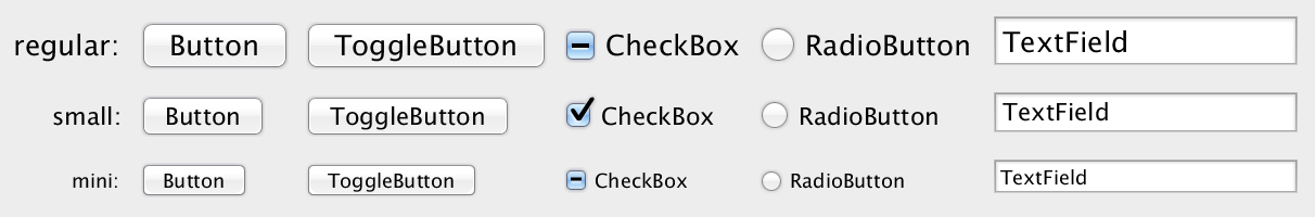
using relative units for dynamic sizing
When using Mac OS X, you will find dialogs, where controls have a smaller size than usual. This is a point, which is adopted to AquaFX. With relative units, it is pretty easy to style size-independend.
AquaFX uses a font size of 13px. The two size variants use 11px and 9px. All style definitions, which have to be dynamic, are defined in em. In my case especially -fx-padding.
This makes my controls to shrink/grow, when the font size changes:
NEVER EVER DO THIS
AquaFX is based on Caspian.css, which means I took the CSS and reworked it completely. This assures, that no component state is overseen. When working on so much components and details, the moment comes, when you loose attention for a moment and assign wrong values to properties.
So, in my code there showed up the following line without being recognized:
As soon as the component, it belonged to, was used in a dialog my VM crashed and a nice greeting from Mac OS X welcomed me:
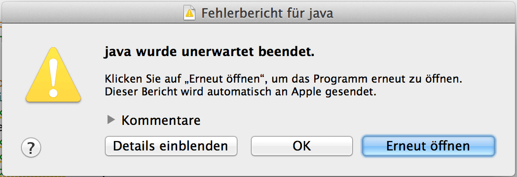
Never, ever do this bad assignment... So, if something like this happens, CHECK YOUR CSS! ;-)
SVGs and icons
I prefered using SVG paths for all tiny icons and symbols, so I'd love to share my way of working on those things. Like everything written here, this is no rule, just a description to show how some details are realized.
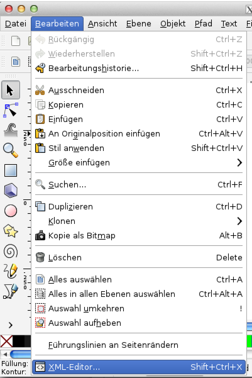
create SVG-paths
To create and edit the SVG paths, I am using the open source SVG graphics editor Inkscape. Graphics can be created and the path can then be copied by selecting the graphic and choosing edit > XML-Editor:
In this pop up the path for CSS is shown and can be copied:
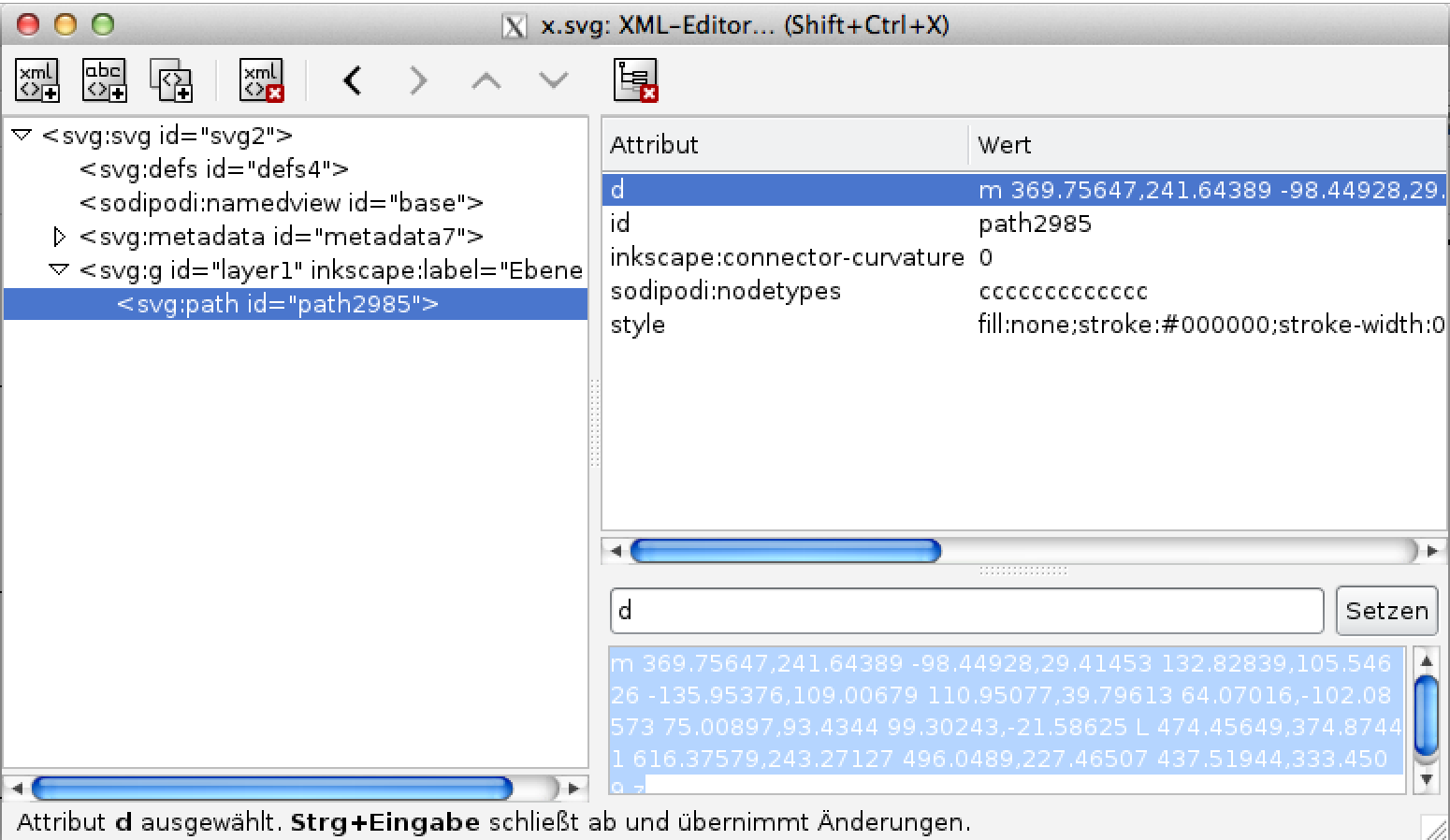
ready to use in CSS by setting -fx-shape: <your path>;
the indeterminate ProgressIndicator
One control, which require SVG paths is the indeterminate ProgressIndicator.

Caspian has a different number of 'rotating' graphics. But, no problem for JavaFX!
This solves the problem.. What you have to do then, is defining every single path with:
.progress-indicator:indeterminate .segment1 { -fx-shape:"...";}
...
.progress-indicator:indeterminate .segment11 { -fx-shape:"...";}
and a little color
and you are done.
In the next part I write more about some specific controls, like Buttons/ PillButtons, Lists vs. Tables, ToolBars, etc. So visit us again :-)